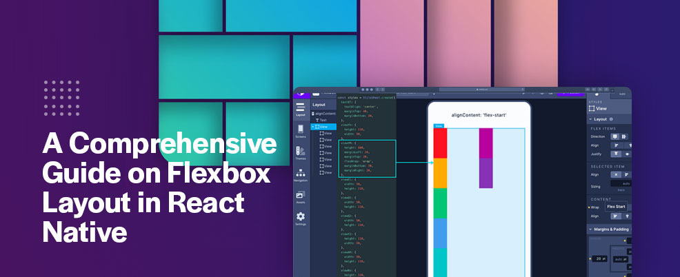
When it comes to building responsive and dynamic user interfaces in React Native, the Flexbox layout system is an indispensable tool. In this comprehensive guide, we’ll take you through the ins and outs of Flexbox layout in React Native, empowering you to create stunning and adaptable designs for your mobile applications.
Understanding Flexbox
At its core, Flexbox (short for Flexible Box) is a layout model that aims to distribute space within a container and align its items in a way that accommodates different screen sizes and orientations. React Native implements the Flexbox system, allowing developers to design interfaces that seamlessly adjust to various devices and display settings.
Key Concepts of Flexbox
Flex Container and Flex Items:
In Flexbox, the container holding the items is referred to as the “flex container,” while the items within it are termed “flex items.” This parent-child relationship forms the basis of the Flexbox layout.
Main Axis and Cross Axis:
Flexbox operates along two primary axes: the main axis and the cross axis. The main axis is defined by the `flexDirection` property and determines how items are distributed horizontally (row) or vertically (column). The cross axis is perpendicular to the main axis.
Flex Direction:
The `flexDirection` property controls the direction in which the flex items are laid out within the container. It can be set to `row`, `column`, `row-reverse`, or `column-reverse`.
Justify Content:
`justifyContent` determines how flex items are distributed along the main axis. Options include `flex-start`, `center`, `flex-end`, `space-between`, `space-around`, and `space-evenly`.
Align Items and Align Self:
`alignItems` aligns items along the cross axis. `alignSelf` can be used on individual items to override the container’s `alignItems` value.
Flex Wrap:
`flexWrap` controls whether flex items should wrap onto multiple lines when they exceed the container’s width or height. It can be set to `wrap` or `nowrap`.
Flex Grow, Flex Shrink, and Flex Basis:
These properties control how flex items expand (`flexGrow`) and shrink (`flexShrink`) to fit the available space. `flexBasis` defines the default size of an item before any available space is distributed.
Implementing Flexbox in React Native
Now that we’ve covered the fundamental concepts of Flexbox, let’s explore how to apply them in React Native.
Creating a Flex Container:
To establish a flex container, use the `flex` style property on the parent component.
“`jsx
<View style={{ flex: 1, flexDirection: ‘row’, justifyContent: ‘center’, alignItems: ‘center’ }}>
{/* Flex items */}
</View>
“`
Defining Flex Items:
Within the flex container, each child component becomes a flex item. Utilize the `flex` property to determine how items grow or shrink relative to one another.
“`jsx
<View style={{ flex: 1, flexDirection: ‘row’, justifyContent: ‘center’, alignItems: ‘center’ }}>
{/* Flex items */}
</View>
“`
Applying Alignment and Distribution:
Use properties like `justifyContent` and `alignItems` to control the arrangement of flex items along the main and cross axes.
“`jsx
<View style={{ flex: 1, flexDirection: ‘row’, justifyContent: ‘space-between’, alignItems: ‘center’ }}>
{/* Flex items */}
</View>
“`
Benefits of Flexbox Layout in React Native
Responsive Design: Flexbox simplifies the creation of responsive layouts that adapt seamlessly to different screen sizes and orientations.
Efficiency: It eliminates the need for complicated CSS calculations, making layout design more intuitive and efficient.
Dynamic Alignment: Flexbox provides consistent alignment and spacing without resorting to manual adjustments.
Easy Reordering: Flex items can be reordered easily by altering their position in the code, which is especially helpful for mobile app interfaces.
Cross-Platform Compatibility: Flexbox works consistently across various platforms and devices, maintaining a uniform look.
Conclusion
Mastering Flexbox layout in React Native empowers you to design flexible, adaptable, and visually stunning user interfaces. With an understanding of its core concepts and implementation techniques, you can create responsive layouts that cater to diverse user experiences, ultimately enhancing the appeal and functionality of your mobile applications. Flexbox is more than just a layout system; it’s a powerful tool in your toolkit for creating exceptional UI/UX in React Native.
How can we help you?
We understand the importance of catering to various device sizes and orientations. By implementing Flexbox, we ensure that your app’s user interface remains responsive, providing a consistent and visually appealing experience across smartphones and tablets.
Our expertise in Flexbox allows us to efficiently design complex layouts without resorting to cumbersome calculations or workarounds. This efficiency translates to reduced development time, enabling your business to launch your app sooner.
Flexbox’s dynamic alignment and distribution capabilities enable us to create layouts that adapt to different user interactions. Whether it’s aligning content, adjusting spacing, or handling reordering of elements, we can tailor the user experience to meet your business’s unique requirements.
With our proficiency in Flexbox, we ensure that your app’s layout remains consistent and visually pleasing across iOS and Android devices. This cross-platform compatibility enhances user satisfaction and maintains your brand’s professionalism.
By tapping into the potential of Flexbox, we enhance your app’s design flexibility, responsiveness, and overall user engagement. Our React Native development agency is committed to crafting user interfaces that captivate users and align with your business goals, ultimately contributing to your app’s success in the competitive mobile landscape.


